
Sacred Design
Honoring God’s Word with Design
Throughout the Middle East, Jews, Christians, and Muslims have long believed that sacred Scripture should be published in a format that honors it as God’s very Word.
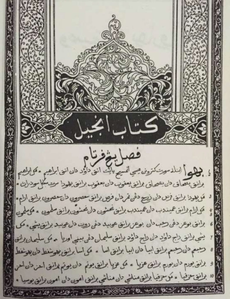
Design expectations for for sacred texts include:
- high-quality tinted pages
- an elegant border enclosing scripture text to separate divine truth from human composition (notes, section headings, cross-references, etc.)
- high-quality binding, decorated in ways that identify it as a sacred book from God
- a green, blue, red, or brown, cover (generally not black, the color of evil and death)
- artistic and colorful title pages
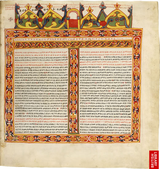
Ethiopic Bible, 17th century 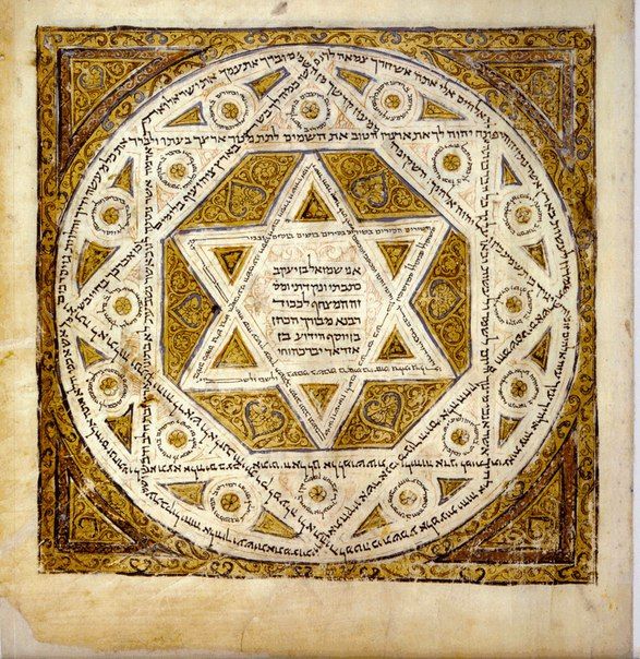
Title page of a Hebrew Bible, 1010 AD 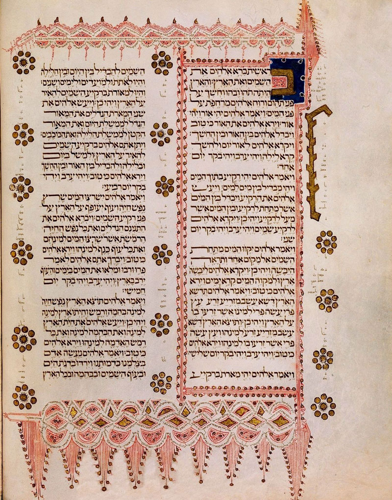
An elegant frame in a Hebrew Bible 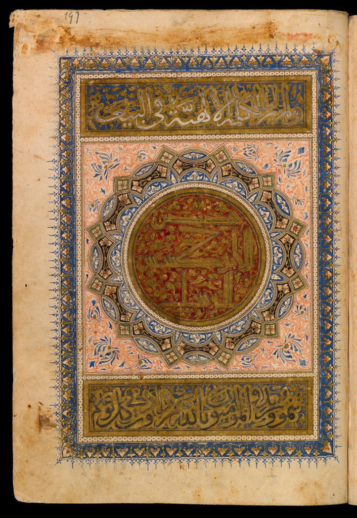
Title page to the Acts of the Apostles, 1342 AD 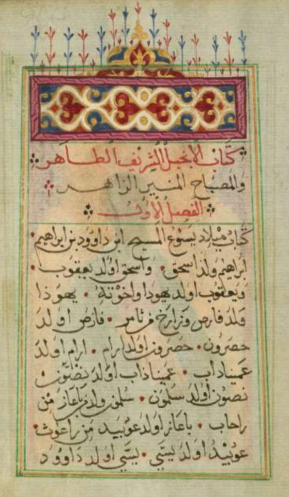
The Gospel of Matthew, 1684 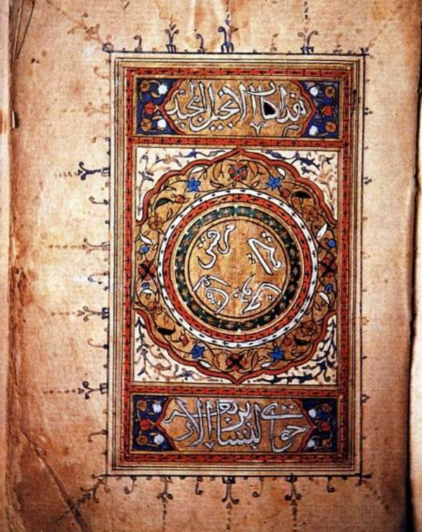
Title page to Arabic Gospels, 1613 AD
Today, Muslim publishers still follow these same standards of reverence in the artistic presentation of the Quran. Early printed Bibles attempted to follow these same standards as well as possible, given the lack of color printing at that time.
Malay Scriptures printed by the Netherlands Bible Society, NT in 1820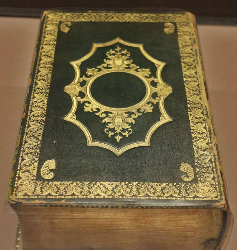
Cover of Van Dyck Arabic Bible, 1865
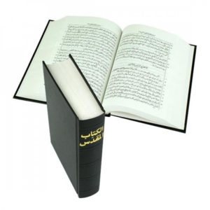
However, beginning in the early 20th century, well-meaning missions flooded the region with cheaply printed foreign-style Bibles that had plain, black covers, plain white paper, and no artistic decoration. Muslims did not regard them as authentic sacred texts but as corrupt and inferior. Muslims could not accept these undignified foreign-style publications as genuine Scripture.
Now, Bible publishers are returning to traditional Middle Eastern scripture standards of quality and beauty that display an appropriate reverence for the book as God’s Word.